


Subscribe to Your Results in AktivBo Analytics
Stay ahead in real estate by integrating real-time tenant feedback with AktivBo Analytics' new features for continuous improvement and proactive...
3 min read
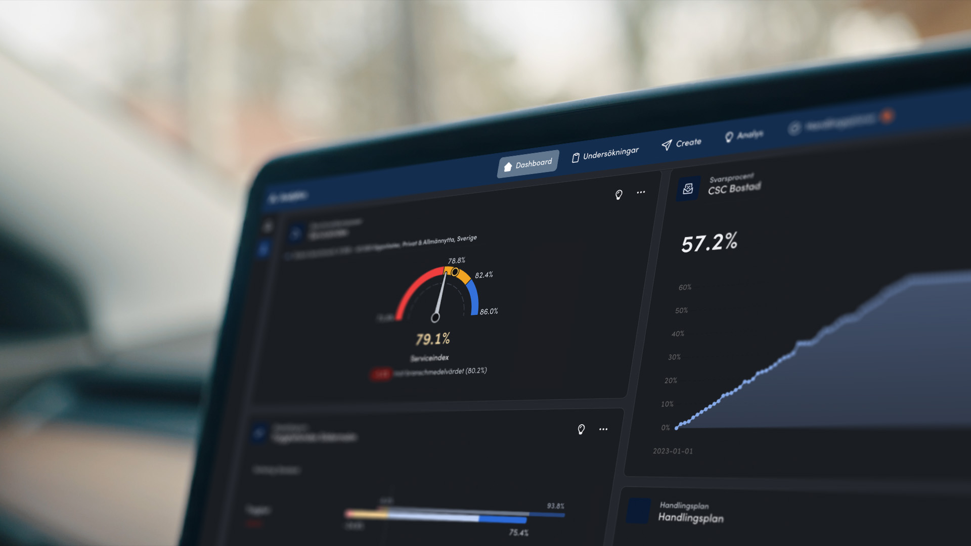
We’ve released one of our biggest updates to date for AktivBo Analytics, featuring several hundred free improvements and new features across the entire platform. All of this with the goal of making it easier to turn your data into actionable insights throughout your organization. Here are the highlights, broken down by area.
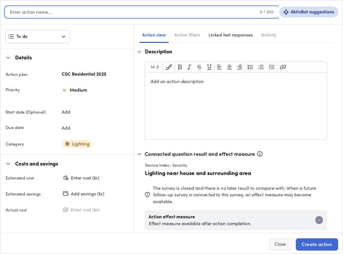
Action plans have received a number of improvements designed to make it easier for you to create and edit actions. We’ve improved the design and usability, and tracking the impact of each completed action in the charts is now even clearer and more intuitive.
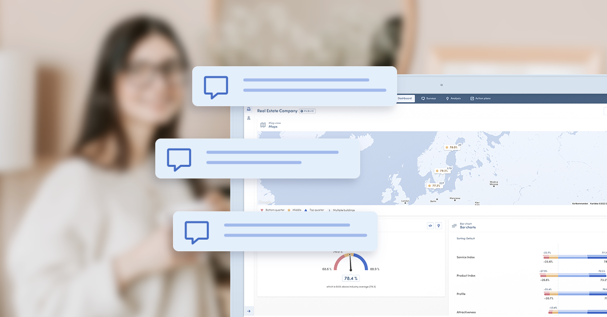
Each action now has its own chat where you can @mention colleagues directly, and which also serves as a work log. Notifications about new comments are sent both via email and within the platform, so that improvement efforts move forward without manual monitoring. This turns the action plan into a living work tool rather than a document that is updated after the fact.
We’ve simplified the filtering so that you work exclusively in the right-hand menu, which means that actions are filtered in the same simple way as in the analysis view. Administrators can also set up their own action filters that apply to all actions, regardless of the type of survey they’re linked to.
The filter section clearly shows which filters are actually selected and alerts you if filter updates or corrections have caused an action to no longer work. For customers using sentiment analysis, that data is also displayed in the text response interface below each action.
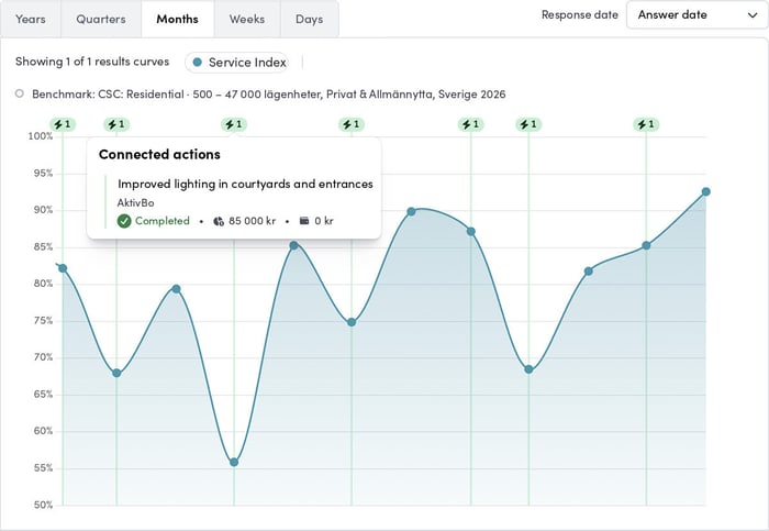
Completed actions can now be tracked directly in charts. This provides deeper insight into how the actions affect the results—at the index, sub-index, and question levels. This makes the link between a completed action and the actual outcome visible in the same view, making internal follow-up easier.
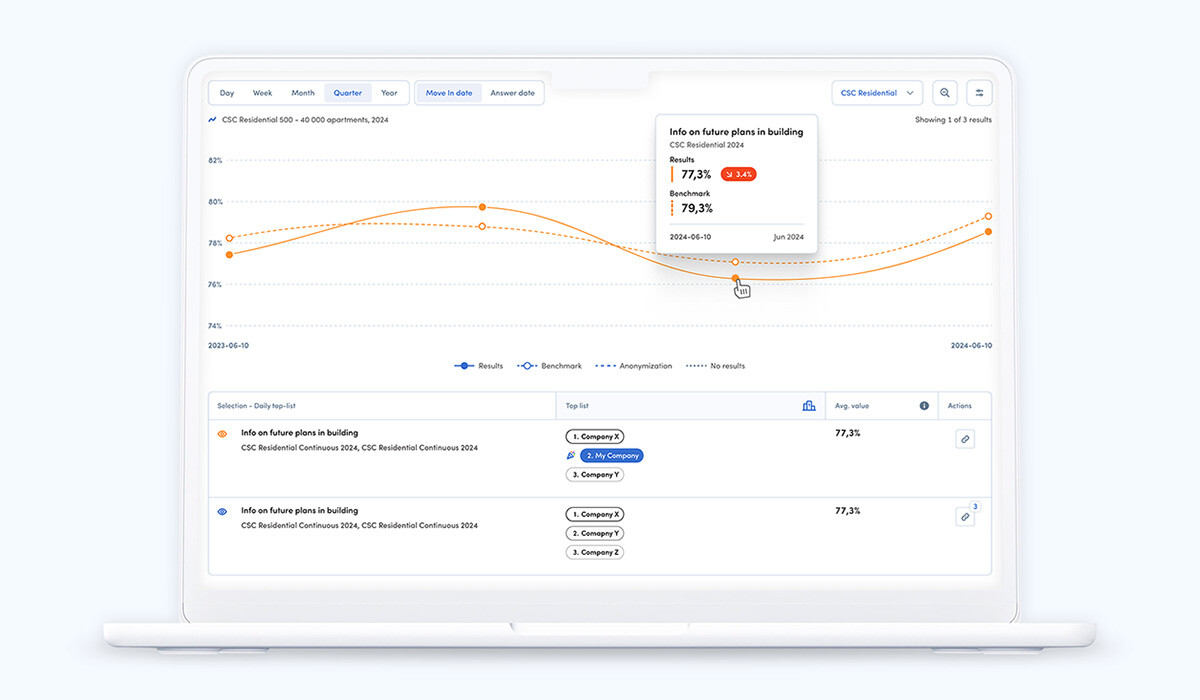
The interface has been updated for faster and easier selection. In addition, there is a new quick-zoom feature that allows you to explore parts of the chart in real time.
PDF exports have been completely redesigned. They now follow your chosen chart design and display all selections along with users, companies, and dates—ready to be shared outside the organization. This means that a report generated in Analytics can be shared directly in a property management meeting, with the management team, or with the board. PDF exports also support sustainability reporting for standards such as GRESB.
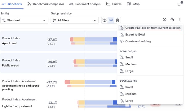
The filter menu has been completely redesigned, with options directly in the menu and the ability to set result grouping on the spot. This makes it both easier to make new selections and simpler to see what has already been selected.
The biggest new feature is a new property-based filter synchronization. Depending on the filter selection in the main analysis, the corresponding properties are selected in the comparison analysis—which, in most cases, eliminates the need to add or correct historical filter values. Any filter in the main survey can be used to select properties in the comparison survey. The previous synchronization based on filter values remains as the default method.
The benchmark compasses now also include “group results by,” which makes it easy to compare different filters from a benchmarking perspective.
For some time now, Analytics has let you analyze submitted text responses based on sentiment and topic, as well as to filter out actionable feedback. We have now also made it possible to visualize prioritized and frequent topics as preset main topics, which provides greater value right from the start. The “All Topics” view now also includes an Excel export option, so you can easily work with the results in other tools.
The entire dashboard interface and widgets now feature even better readability and clearer visualizations. The left-hand menu has been redesigned so that both personal and organizational favorites are now organized into folders.
A new menu for editing dashboards allows you to add a longer, unique description and change the layout style for widget arrangement—two features requested by customers. The longer description is also included in the PDF export.
Staying organized has also become easier: Rearranging personal dashboards is now done through an improved menu. From the same menu, you can bulk-delete dashboards and their associated favorites at the same time, which saves time when clearing out old dashboards.
Administrators can now both view and configure which dashboards load by default for users, so that each user is introduced to the most relevant results immediately at logging in. For organizations with many users in different roles, this makes a difference: the regional manager, the customer service manager, and the analyst rarely need the same dashboard.
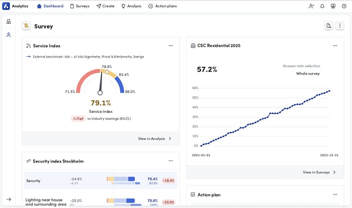
The user invitation workflow has been redesigned with a clearer, more guided layout that gives new users a better start. It’s now also possible to invite multiple users at once and specify in the invitation which organizational dashboard should load by default for them.
This is just a sample of all the updates and improvements you'll find in AktivBo Analytics. Do you have questions or feedback about any of the new features? Don’t hesitate to reach out, or contact your project manager directly for a personalized walkthrough.
Stay ahead in real estate by integrating real-time tenant feedback with AktivBo Analytics' new features for continuous improvement and proactive...

AktivBo Analytics revolutionizes real estate operations with tailored tools, real-time insights, and customizable features, enabling smarter...
Discover the latest upgrades in AktivBo Analytics, including new features for curves and improved interface. Read our interview with CTO Anton...