


1 min read
Major updates in AktivBo Analytics
The development team at AktivBo is continuously working to improve our platform AktivBo Analytics. Most recently, there have been several upgrades...
3 min read
We’ve upgraded large parts of AktivBo Analytics to give you a smoother, more intuitive experience when working with tenant feedback. With over 250 improvements, fixes, and new features, the platform is now more powerful than ever – helping you turn insights into action even faster.
 The left-hand menu has been completely redesigned, making navigation simpler and more informative. The new layout ensures a smoother experience with quicker access to key tools and clearer insights at a glance.
Managing your favorites has never been easier. A fresh design with improved icons and readability makes it simple to find what you’re looking for. You can now search instantly, keep favorites automatically sorted into yearly folders, and even see clear guidance if you haven’t set any up yet.
A brand-new surveys menu brings clarity and flexibility. Select both primary and comparison surveys in one place, with a dynamic interface that reduces clutter by showing only what you need. Lock date intervals to keep them consistent when switching surveys, and explore new, easy-to-recognize icons for each survey type.
Working with indexes and questions is now faster and clearer. Unique icons distinguish AktivBo indexes, groupings, and custom questions. Instant search and smarter selection tools make finding exactly what you need easy.
 Survey and comparison selectors have been improved with better design, new icons, and smarter search. You’ll see the latest surveys first, with clear tags showing whether they’re continuous or static. The comparison selector shows which survey is set as the standard comparison survey. The new date interval selector for continuous surveys makes it much easier to set, adjust, and compare intervals, and supports dynamic comparisons that update automatically over time. For continuous surveys in particular, working with date intervals is crucial for meaningful comparisons.
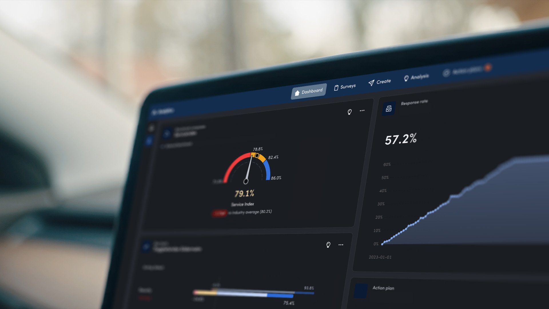
The Analysis tab has been updated with clearer and improved headings showing survey types (CustomerScoreCard™, move-in, fault report, and more) and selections clearly. Bar charts feature a cleaner layout, smarter filters, and a new button to show only selected indexes – saved in favorites for consistent dashboards. Information symbols explain the current visualization and the data shown, ensuring insights are always easy to interpret. Dashboards and charts are easier to customize, helping you focus on what matters most.

The right-hand menu now provides key context at a glance, such as number of respondents and response rates. Response rate adjusts dynamically depending on your selection of filters, and a new “My filters” feature lets you save personal filter settings that follow you across surveys – saving time and keeping analyses consistent.
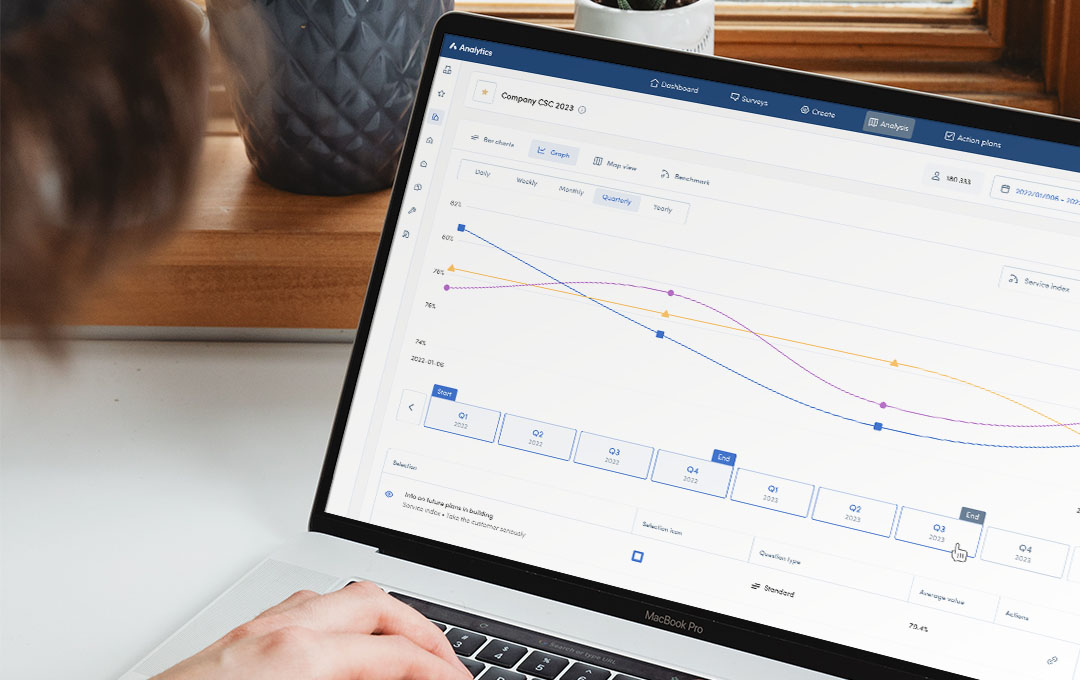
 Visualizing trends is easier than ever. Compare multiple dynamic benchmarks to visualize industry trends over several years, group curves by filter, and track continuous CustomerScoreCard™ feedback with improved presets.
Dashboards have been improved with a redesigned top menu featuring new buttons. The Edit and Create widget modals now have a better layout, making it easier to manage your widgets. You can now give each widget a unique name instead of inheriting the favorite name, allowing widgets to be named independently in a way that better reflects the dashboard setup.
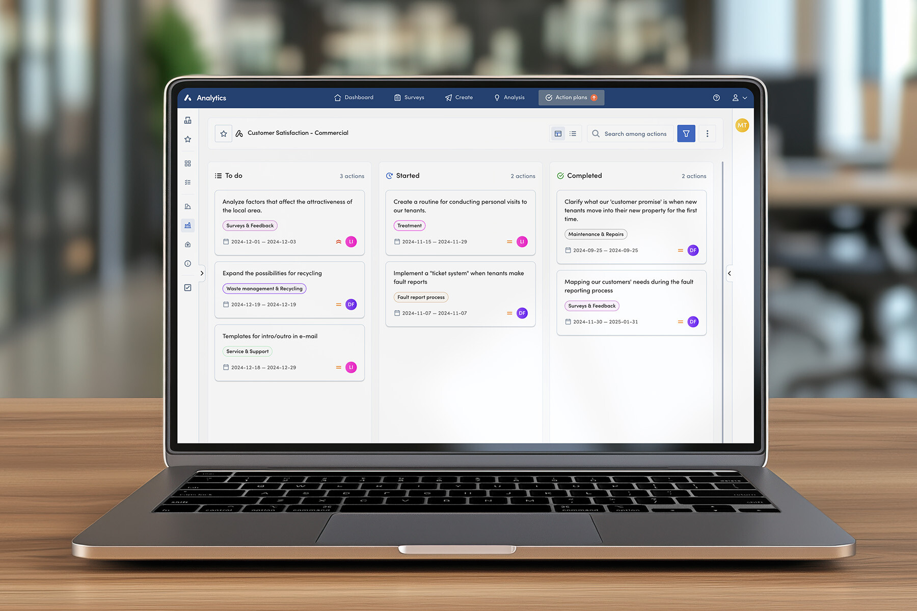
Turning insights into actions is smoother with improved hover menus that display more details at a glance. The set filters now also show the actions displayed in the analysis tab, and categories have been updated based on user feedback, ensuring your action plans are structured and relevant.
User and admin tools have received a major usability boost. Profile pages come with more customization options, while admins gain streamlined control over users and surveys. Inviting, managing, and assigning access is now faster and more transparent, keeping administration simple and secure.

For those who prefer working in darker environments, AktivBo Analytics now supports dark mode across all views. Save it as your system default, or let it adapt automatically to your computer’s settings for a seamless experience.
In addition to the improvements above, we have also implemented over 250 updates across the platform. Information messages are now more cohesive, scrollbars are easier to see and use, and maps and toolbar functions have been updated for smoother handling. Internal benchmarks automatically adapt to your selected filter, and permissions for favorites can now be set directly when creating widgets – saving you time and clicks.
1 min read
The development team at AktivBo is continuously working to improve our platform AktivBo Analytics. Most recently, there have been several upgrades...
1 min read
You gave us feedback – and we have listened! With an updated design of Analytics, you will experience an improved design as well as improved...
1 min read
Almost all professional real estate companies and property owners conduct tenant surveys to increase efficiency, customer satisfaction and improve...